


Power BI has a Jurassic Park problem
Just because you CAN do something, it doesn't mean you SHOULD.


Years and years ago (like, pre-podcast era) I heard a radio interview with a Russian who had escaped to the West just before the fall of communism. The only part of the interview I remember is that he tried to go grocery shopping once he got settled into his new life in America and couldn’t.
One of the items he went to buy was a jar of jam. In contrast to his old life, where finding jam at the grocery store was sometimes a rare event, he found a huge assortment of jam at his new grocery store. Different flavors. Different sizes. Different qualities.

He was simply overwhelmed by choice. It was TOO MUCH. After decades of having to just use whatever jam (sometimes) would up in a grocery store, he was hit over the head with basically every jam ever.
He ended up being paralyzed by choice, leaving his cart in the jam aisle, and going home, not buying anything as he was too overwhelmed by the experience.
Power BI dashboards have this same problem, and it hurts them. It paralyzes the people who try to use dashboards to do their jobs.


Big news! My new project, How To Use Power BI, is starting and growing.

As I’ve learned and worked with Power BI over the past 5+ years, I’ve been at my most frustrated when the learning curve seems especially steep and/or when something new I’m learning (I’m always learning) is explained by others in either inaccessible (jargon) or inadequate ways.
I’ve always wanted a resource that explains Power BI in small and easy bite-size chunks, so when I’ve need to learn about something, I can learn and apply that knowledge quickly. No searching through google and youtube to find the answer. No searching through an hour long video for ONE thing I need. Just easy fast posts (with short videos as much as possible) that are direct and focused.
That resource doesn’t exist. So, I’m building it.
I’m building a learning resource so I can teach others (anyone) how to use Power BI. Like, right from the beginning and getting started having never used it before right to super advanced things like complicated DAX measures, coding data security rules, and filtering a data connection.
But, don’t worry… this will still be about making beautiful and USEFUL reports that people love. Most of the Power BI world makes very user-unfriendly dashboards, and I’ll always be fighting against that, so How To Use Power BI will also include visual hints and design sensibility and UI/UX sensitivity.
This obviously will be a ton of content, and it won’t be built overnight, but I’m starting.
All the basic/beginner material will be free (and always will be).
Get started. Subscribe for free here:
Where I’ll be next: Fredericton!
In May, I’m headed to Fredericton, New Brunswick (a small but lovely city on the east coast) for the annual conference of the Canadian Evaluation Society.
I’ll be presenting a talk that has been growing and evolving at different conferences over the past year. It’s about how Data Literacy initiatives *never* work as planned and why that is, and how to fix it with Data Visualization.
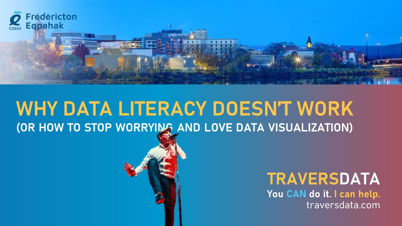
I’ll also be talking about Power BI and data visualization with whoever in Fredericton wants to listen.
How I can help YOU:
Connect with me… I can help you learn Power BI or design a dashboard or other data product that your boss/staff/partners will love. I’ll make it fun, too.
Stay connected:
Website - https://www.traversdata.com
LinkedIn - https://www.linkedin.com/in/traversdata/
Instagram - https://www.instagram.com/travers.data
Power BI Training
- Beginner and Advanced)
- In-Person and Virtual Options
Design
- Custom Power BI dashboard creation
- Clean, organized, and user-friendly design
Power BI Support
- Don’t spend hours/days/weeks trying to figure something out. Talk to me and get it solved quickly.
Other Data Visualization Services.
- Excel data visualization
- Report design
- Powerpoint design