Tough Love: Microsoft makes Power BI dashboards awful and difficult on mobile. These are the facts.
Hey there.
My daughter and I have been watching the Star Wars TV series Andor recently, and it has got me thinking about story-centric design.
Andor isn’t a typical Star Wars show.
It’s not about jedis, or lightsabers. I don’t think they’re even mentioned. Vader isn’t mentioned, either. The Emperor is mentioned once, I think (we still have a couple episodes to go).
The point of the show is it’s about the regular people (like us! no magical powers!) who, in fits and starts, against overwhelming odds, plan and finance a rebellion that brings down the Empire.
That’s what you see. The creators of the show has focused the plot to what the story is about and doesn’t let everything else going on in the galaxy (and there’s SO much of it) distract and take away from the story. It’s a small story, within a much larger context. Everyone is already aware of the context, so there’s no sense spending time on it and distracting from the core narrative.
And this, in a roundabout way brings me to the point of this post… that the mobile version of your dashboard should be the Andor of Star Wars.
It should be focused, user-friendly, and free from distractions, and it’s very very RARE to see a mobile version of a dashboard that has these qualities, and it’s mostly Microsoft’s fault. The ENTIRE infrastructure around mobile Power BI reports is not designed for users, at all.
(heck, that’s a big complaint I have about Power BI and those who develop with it in general)
Strap yourself in… we’re about to go on a journey and take everything mobile apart.
What does Microsoft give us for mobile? Not a hell of a lot.
Let’s start off by looking at one of Microsoft’s “sample” dashboards that they provide on their “Learn” site. This is what one of the pages looks like on their “Customer Profitablity” dashboard:
I am NOT a fan of this sample dashboard, and if you’ve been reading my posts a while (or have worked with me in the past) you probably know this already.
In fact, maybe I’ll base a future edition of People-Friendly Power BI just on the screenshot above… considering I can see 10 design and layout deficiencies immediately just from a quick look at that screenshot…
Let’s pretend this is our dashboard… and that we’ve published it to the Power BI service and made it available to our colleagues or other stakeholders.
Want to see what they see when they open it up on their phones?
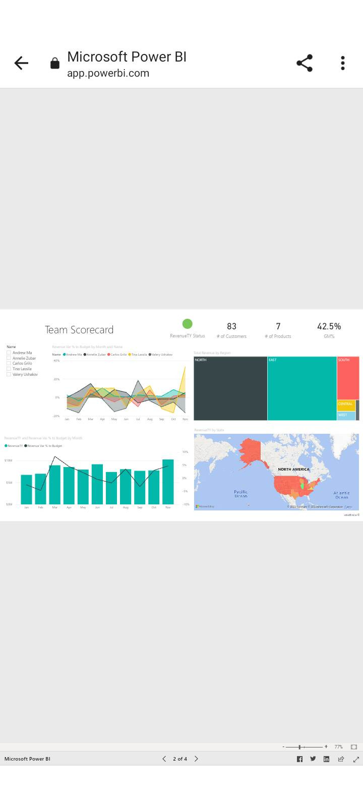
Everything is very small, very hard to read, and hard to interact with. You can try tapping on a data point with a finger and hope you hit the right one (or even navigate to other pages using the miniscule page controls at the very bottom.
Now, let’s see how this looks if we flip our phone sideways and make people look at your dashboard that way (you’re already making them do extra work just to try and see anything in your report):
It’s not really ANY better, is it? It’s *slightly* larger, but it’s still hard to read anything or tap on anything. There IS a *zoom* feature on the lower right … but again, WHY are you making your viewers do Extra Work just to see the data? A Power BI report on a phone is horrible.
Now, Microsoft *does* have a Power BI app for phones (for both Apple and Android, and probably the Microsoft phone… if that’s still a thing?), and guess what this report looks like using their app.. their app built for phones?
Basically the same right? The navigation buttons along the bottom are a bit more usable now, but otherwise, this report is just as unusable even within the official Microsoft Power BI app!
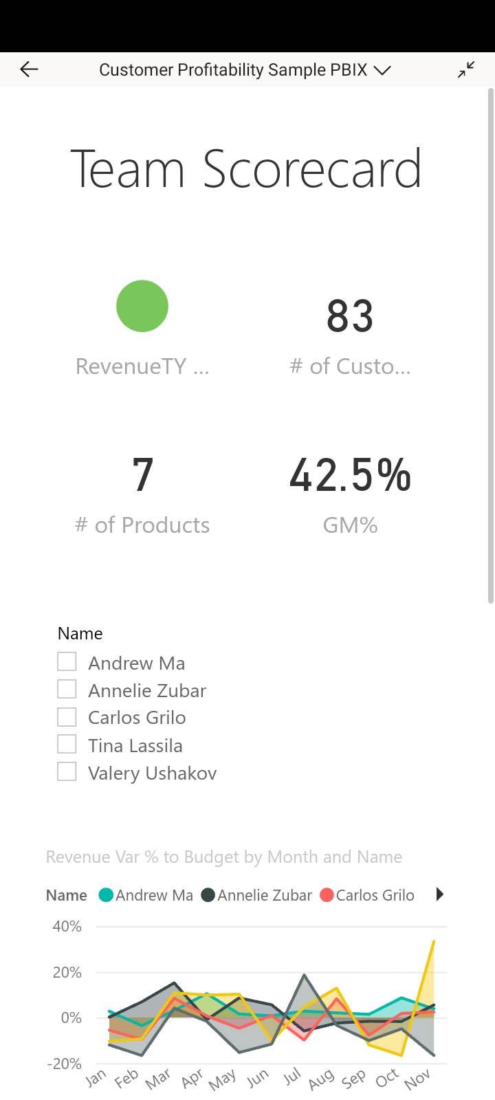
All right… next step is “Optimizing this report for mobile” which is a tool you can use in Power BI Desktop to make customize each page of your report so it’ll look better on a phone. You can make a “mobile” view and move stuff around to fit into a portrait-orientation phone view. Here’s what it looks like:
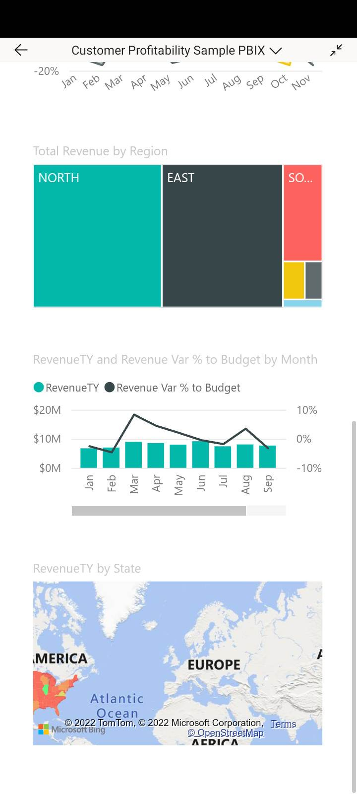
So, this is a little better… our visuals are a bit more usable now (and we now have to scroll down to see the whole report), and while it’s still not easy to tap on things to get things like tooltips popping up, we’re getting there.
FYI, even IF you have mobile-optimized your report in Power BI Desktop, the above view will ONLY show up in the Power BI app. It’ll STILL look small and cruddy if someone accesses your report without the app.
Design for your medium and your user
So, with all that said, the main issue with this dashboard right now is that it’s NOT a dashboard anymore. A dashboard should be a quick at-a-glance look at high level insights. This is no longer at a glance. This requires scrolling… and there’s not even very many visuals on this dashboard page.
We are using a different medium here. Someone isn’t sitting down at their laptop (or desktop) computer and accessing this mobile report. They are on their phone and maybe need a few bits of data to do their job or make a decision while on the go. They don’t NEED everything on their phone.
This isn’t a dashboard anymore. You user can’t see everything on a page at the same time anymore. This is now a series of charts, mainly looked at on their own. If someone needs to compare one metric with another, it’s probably not going to work on mobile without a chart built with that specific purpose in mind
The ideal way to fix this is to make a report that is designed for mobile first. This will likely require a separate report being built with page sizes that match a phone screen ratio. While Microsoft does allow for formatting changes when setting up a mobile report, it’s not enough to make something actually usable.
Think about what your favorite apps look like on your phone. Maybe it’s facebook, maybe it’s instagram, maybe it’s Gmail, maybe it’s a banking app. NONE of them look like the desktop versions of their websites do they? They are ALL simpler, basic, and easy to use.
Get rid of (most of the) stuff.
If you have a ton of data and visuals in there (or just make people use the default desktop version, there’s a ton of distractions, everything is too small, and you’re gonna lose people. No one will like viewing your work on their phone.
Talk to your viewers. Find out what they actually need from the mobile version while they are on the go. They likely only need some key numbers or a “snapshot” graph of where things are at present, or if a certain value (or values) are increasing or decreasing.
They likely don’t need to see 2 years of historical breakdown about a metric, or a map of what’s happening with a product/client/widget across the entire United States (or any country), or excessive detail.
Think (and breathe and care) about accessibility
After you figure out what you TRULY need in a mobile version of a Power BI report, you then have to think about accessibility.
Everything is smaller on a phone. Text is smaller. Maps are smaller. Data points are smaller. Data Labels are smaller. While you may be young and have perfect eyesight, a lot of your colleagues may have vision challenges, or just need help. Your manager is likely older than you. Senior management may be in the 50s or 60s.
You want them to LOVE the reports you build them, and they’re gonna need to see things on their phones too. You may be tempted to add a lot of stuff to a mobile report to impress your boss, but guess what? They already hired you because they know you know your stuff. For a mobile report they need key facts. That’s it.
Wow them with the non-mobile report, if you need to. Do not do it on mobile. It’ll make your report harder to use on their phones.
Reduce the Interactivity, the bells, the whistles.. this isn’t the circus!
On Mobile, get rid of the Tooltips and Drill-Through filters. They are hard to access and interact with. If drilling down into data is needed on mobile, put it on a new page and put a big ol’ navigation button to that page so they can see it and access it easily.
Technology Accessibility
Finally - think about your users and the capacity they have for accessing content on their phones.
There are many places in the world (and even large expanses here in North America) with very poor cell service. There are even more places with poor wifi.
If you’ve made a mobile report with tons of visuals and content and data to download, it’s going to take a looooong time for your viewer to access it. So keep your reports as simple as possible. It’ll speed up loading time and your report will be used more.
Let’s summarize!
- Power BI reports look awful on phones. They’re small and inaccessible. Do not live with the defaults Power BI provides. They’re horrible. If your viewers need to view reports on their phone, BUILD them something that will work on their phone.
- Design a version of your report specifically for mobile, bringing in only the key essentials your dashboard users need while they are on the go. You need to TALK to your viewers and find out what they need.
- On mobile, your dashboard is in a different format. Design for that new format. It’s now impossible for a viewer to look more than 2 charts at once. Tell your data stories one chart at a time.
- Accessibility is always important, but even MORE important on mobile. Design for people with vision challenges and/or technology / wifi access issues.
Do these things, and even within the horrible mobile infrastructure surrounding Power BI reports, your report users will like what you do.
Can I help you out with your Power BI report design? Ask me! This is what I do (and teach people and organizations to do!)
Get in touch with me. I love to teach people new things.
You can reply to this email (or comment below if you’re not reading this in your email.)
Email me at joe@traversdata.com
Msg me on twitter @josephtravers
Connect with me on LinkedIn @traversdata
If you enjoyed this post and want to share it with someone, share away! Sharing is caring.
If someone sent you this post or saw it on twitter or LinkedIn and you want to subscribe so you don’t miss a future post, you can do that below:


